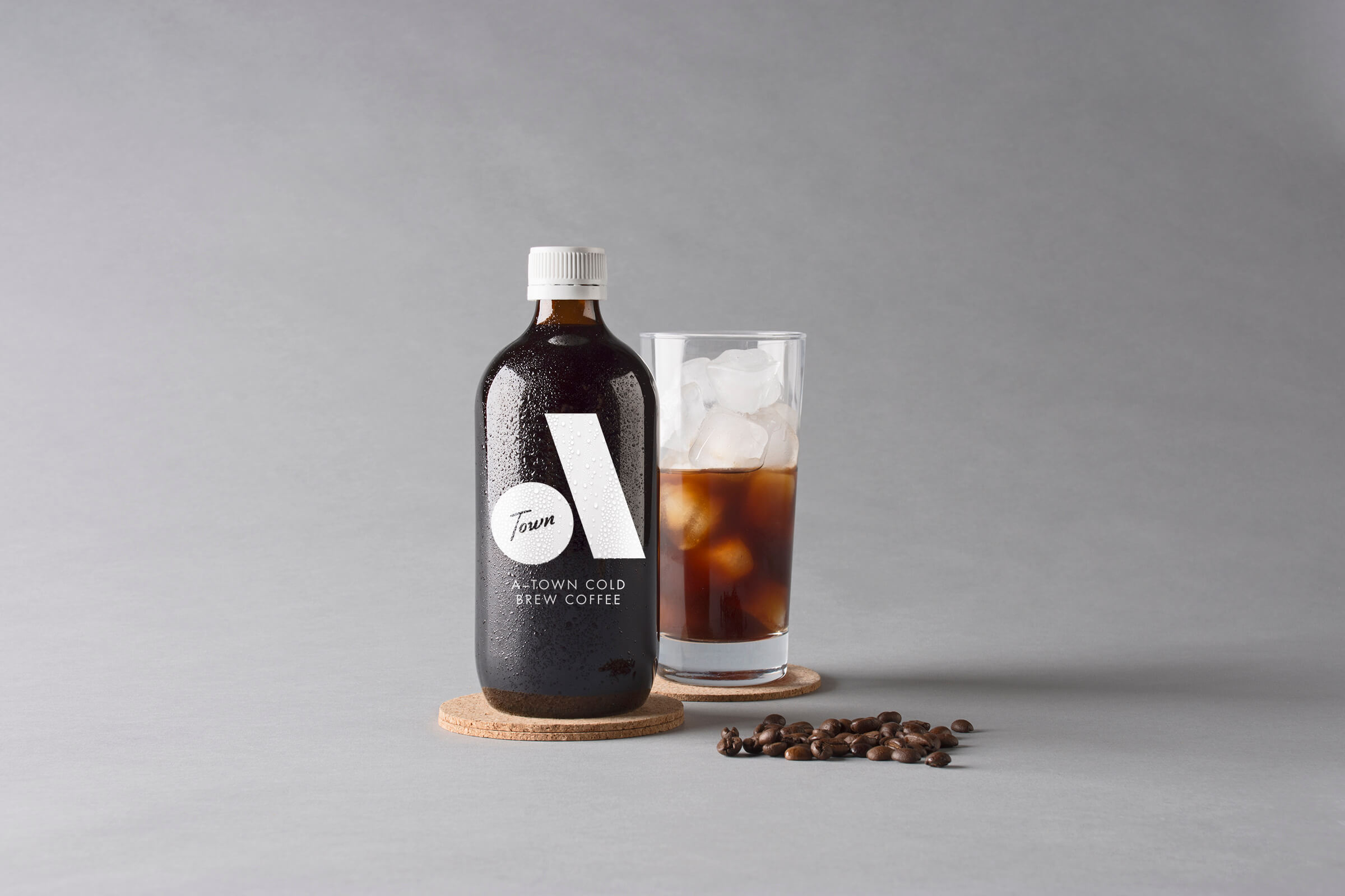
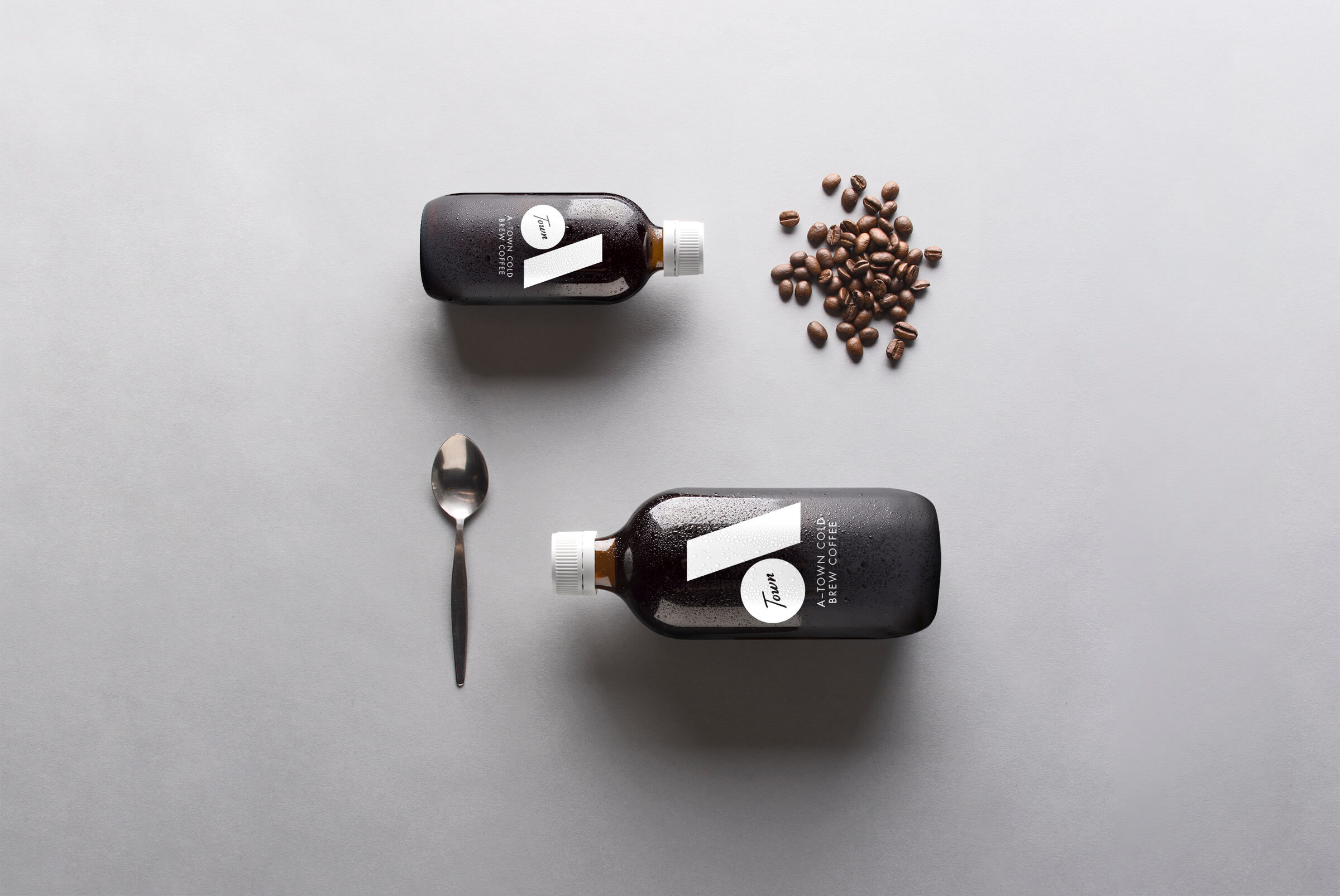
A-Town Cold Brew Coffee
Hailing from a city not yet especially known for its coffee, this Adelaide roasted cold-brew called for a logo and packaging that would stand out proudly on the shelf, chest puffed, unmistakably declaring its origin and quality.
Enter the name A-Town and a bold, memorable logo designed to pack as much of a punch as the liquid gold inside.
Elements were kept minimal and modern, with a large, geometric ‘A’ subliminally reinforcing the brand’s intended premium A-grade market position.
Contrasting with these simple shapes is a smooth, free-flowing script; evoking an image of Adelaide’s clear, aquamarine waters and those deliciously languid summer days.
Photography: Joseph Mildren

