Perihelion
The term “perihelion” refers to the point when an orbiting planet or celestial body is closest to the sun. In Greek, the word literally means around (peri) the sun (helios).
Earth’s perihelion occurs during the Australian summer, with January 3rd, 2024, slated as the next occurrence. During this time, grapes plump and ripen under the sun in the verdant vineyards of the picturesque Adelaide Hills wine region. The region’s rich soil and sun-soaked South Australian climate contribute to world-renowned, full-flavoured wines.
Winemaker Chris Coulter created Perihelion as an export-targeted range, nodding to the ‘time in the sun’ that Australian wines have been enjoying internationally.
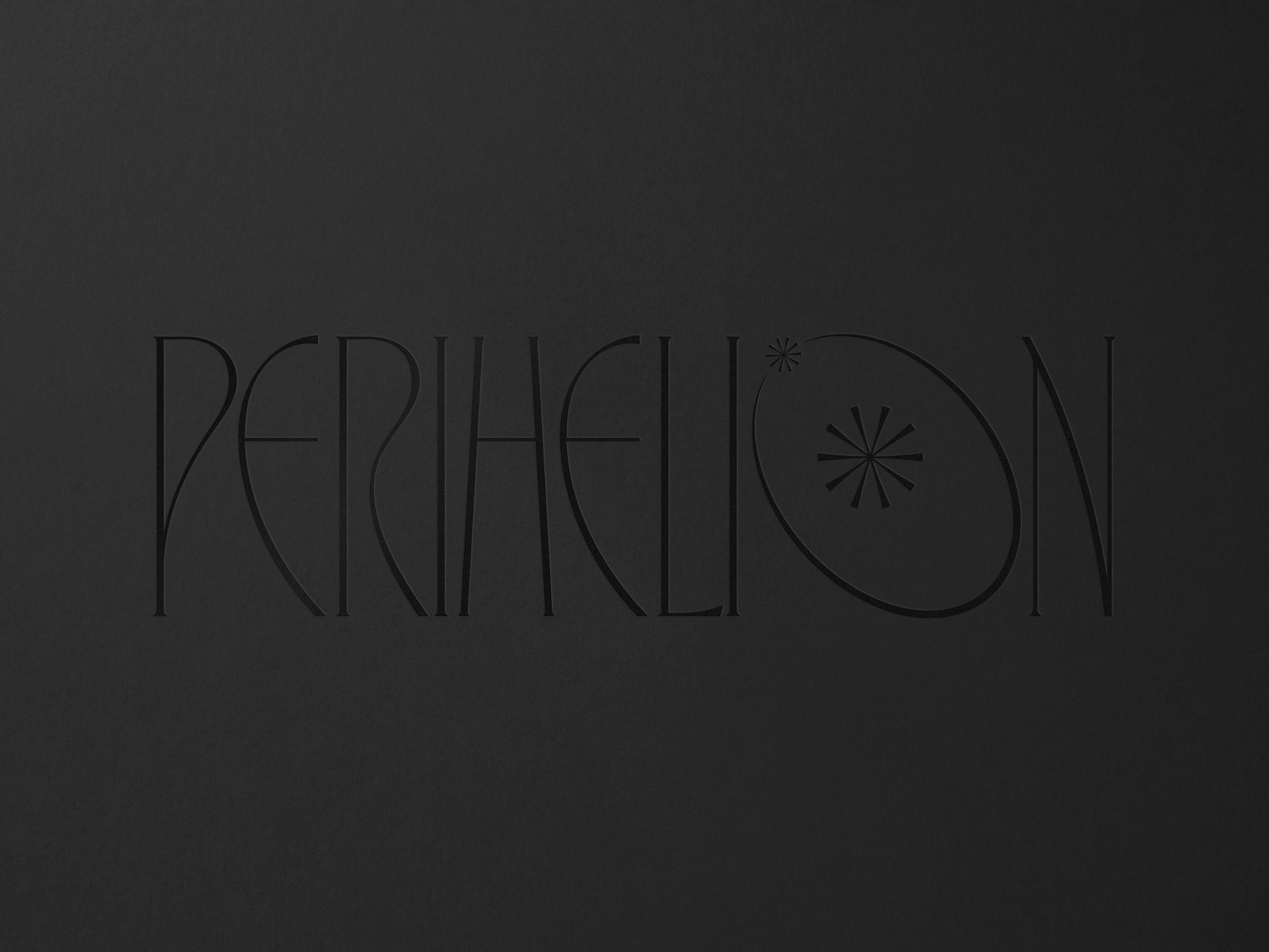
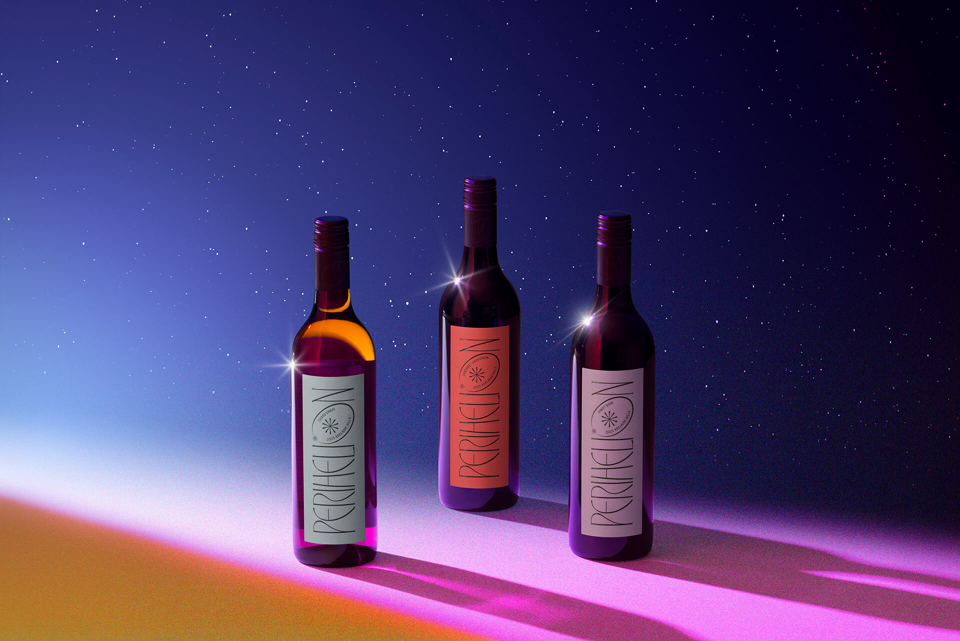
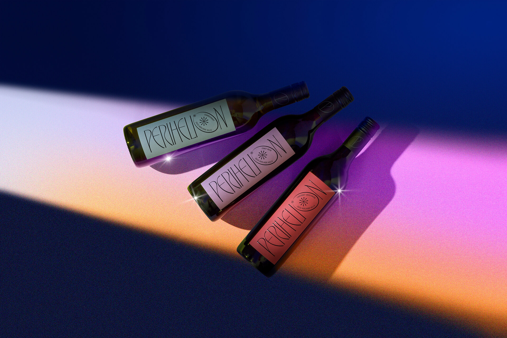
For the wine label design, we focused solely on the logo and typography, ensuring no artwork or imagery would distract from the brand’s essence.
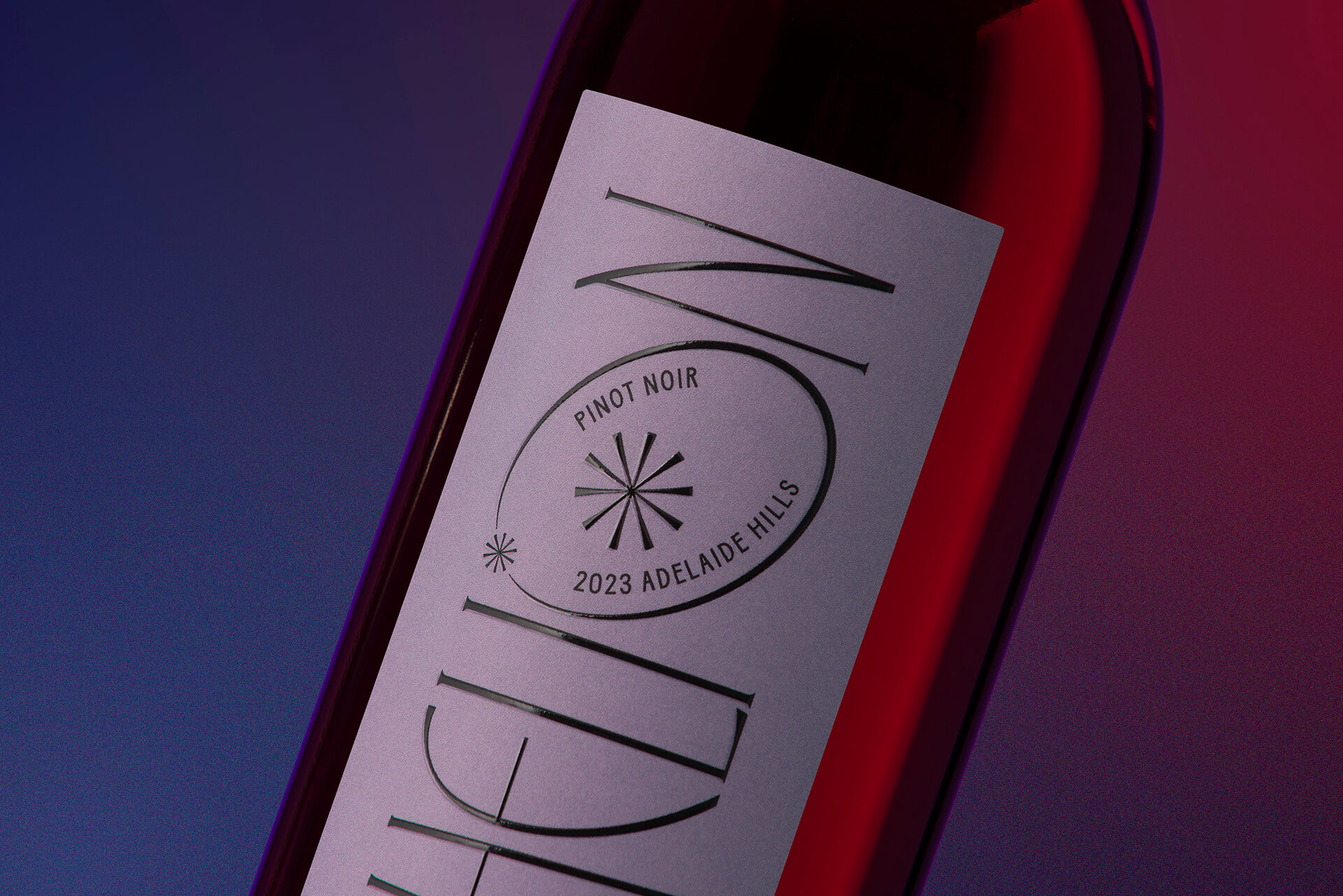
To highlight Perihelion’s minimal intervention methods and sustainable practices, we incorporated smooth curves and organic, natural shapes. This approach blends with a sharp, precise elegance, evoking the style of artwork seen in fantasy or sci-fi film title sequences. It also reflects the sense of mystery surrounding our solar system and its celestial bodies.
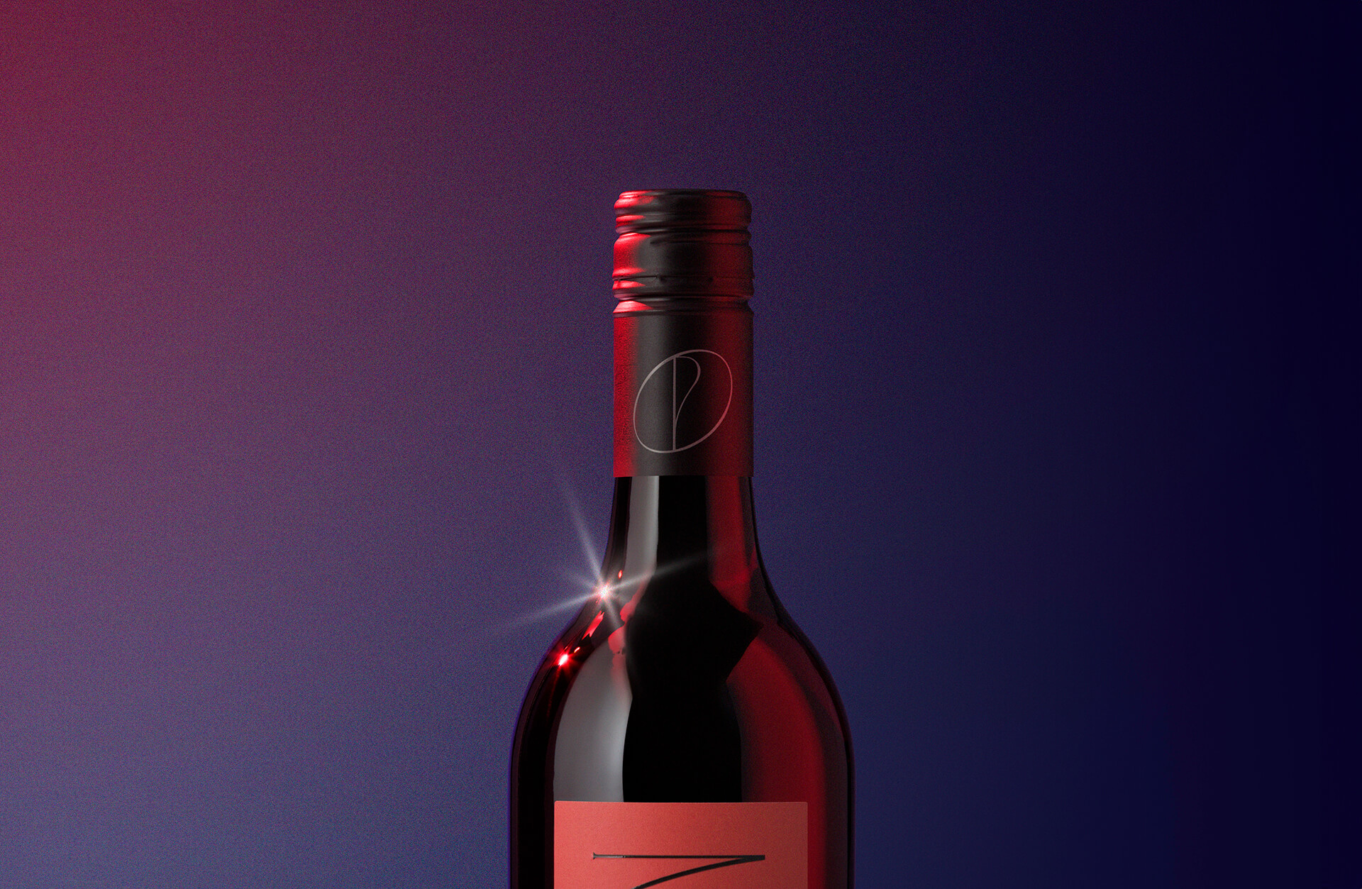
To enhance interaction with light, we chose a high-build finish, creating depth and accentuating the curves of the typography. Drawing inspiration from the colours of the Southern Lights (Aurora Australis), we softened their tones to achieve a sophisticated, premium aesthetic.
Featured on TheDieline.com
Photography: Mark Lobo
