Serendipity Spirits
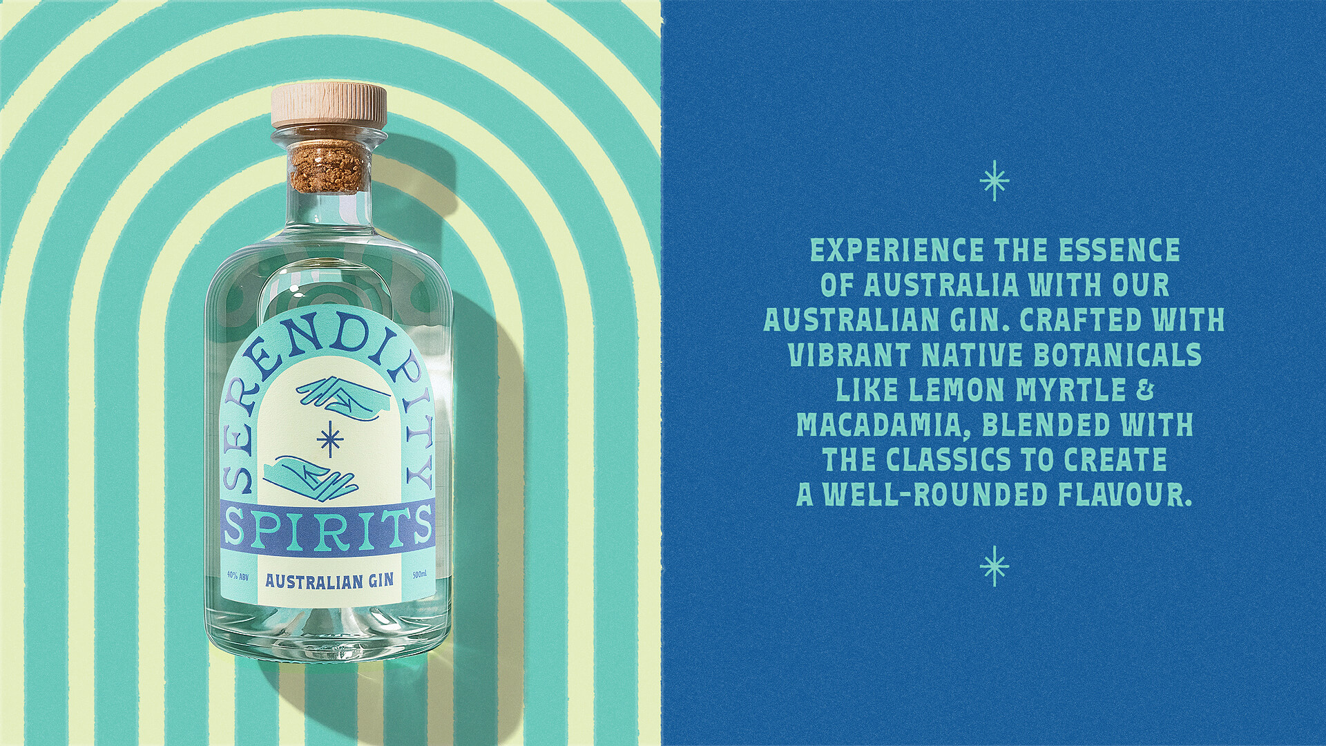
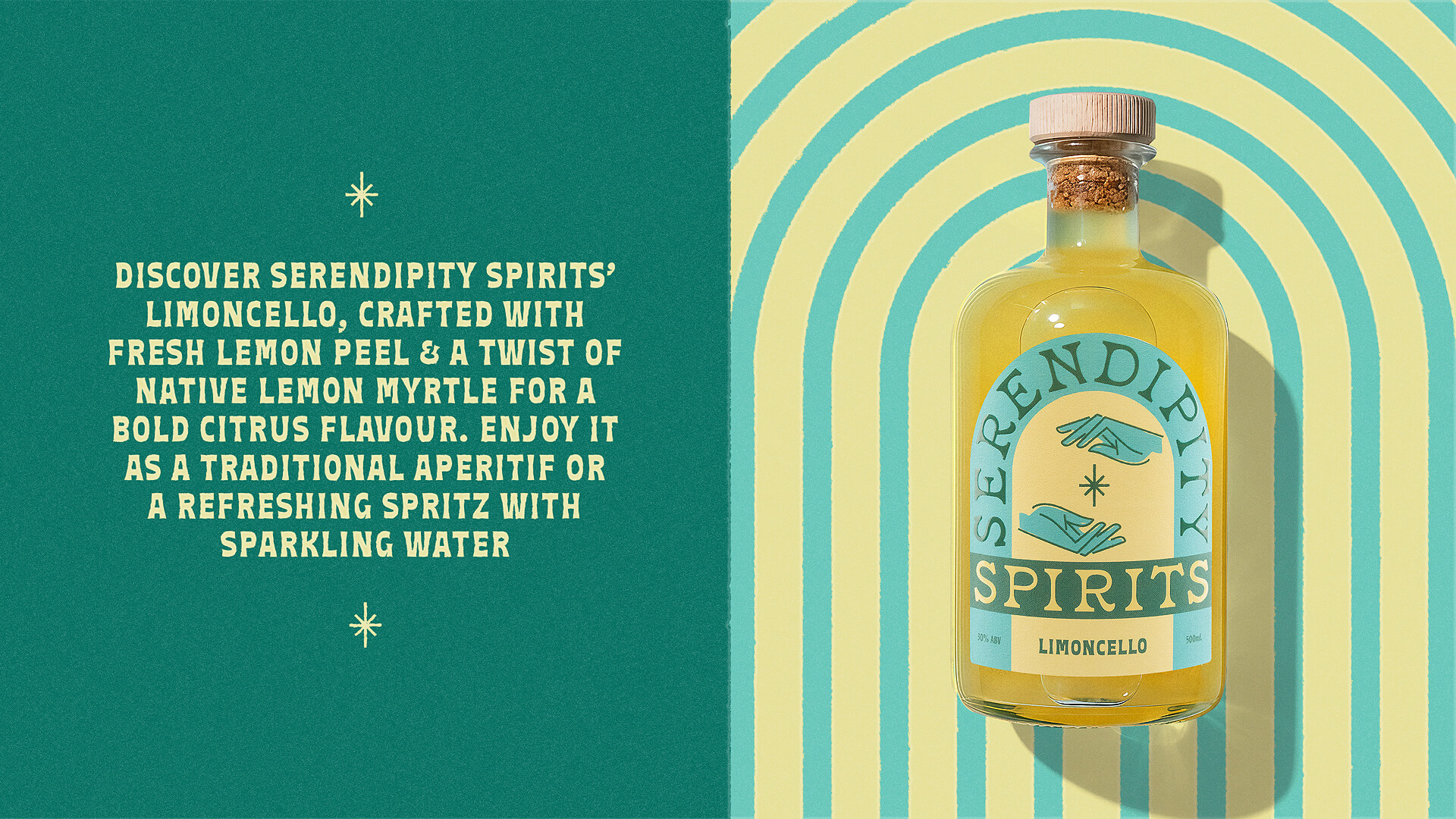
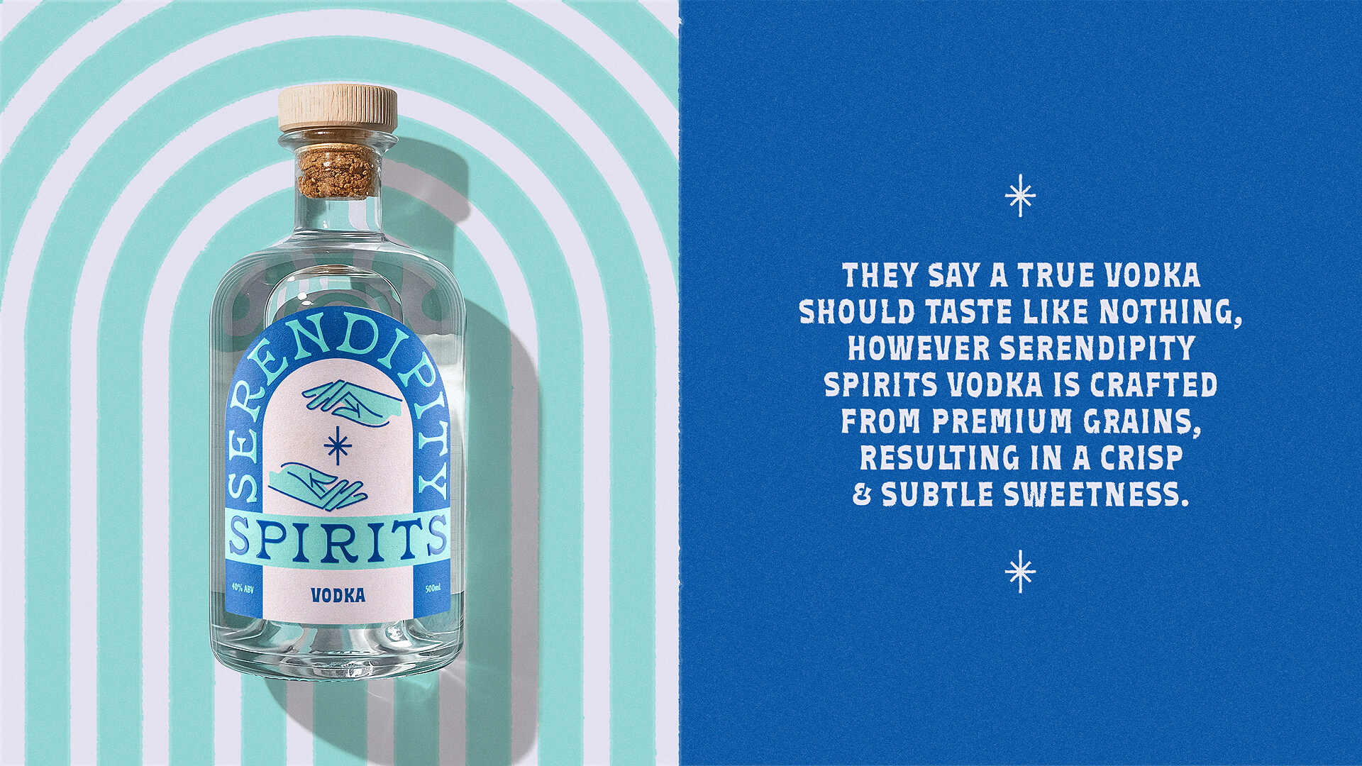
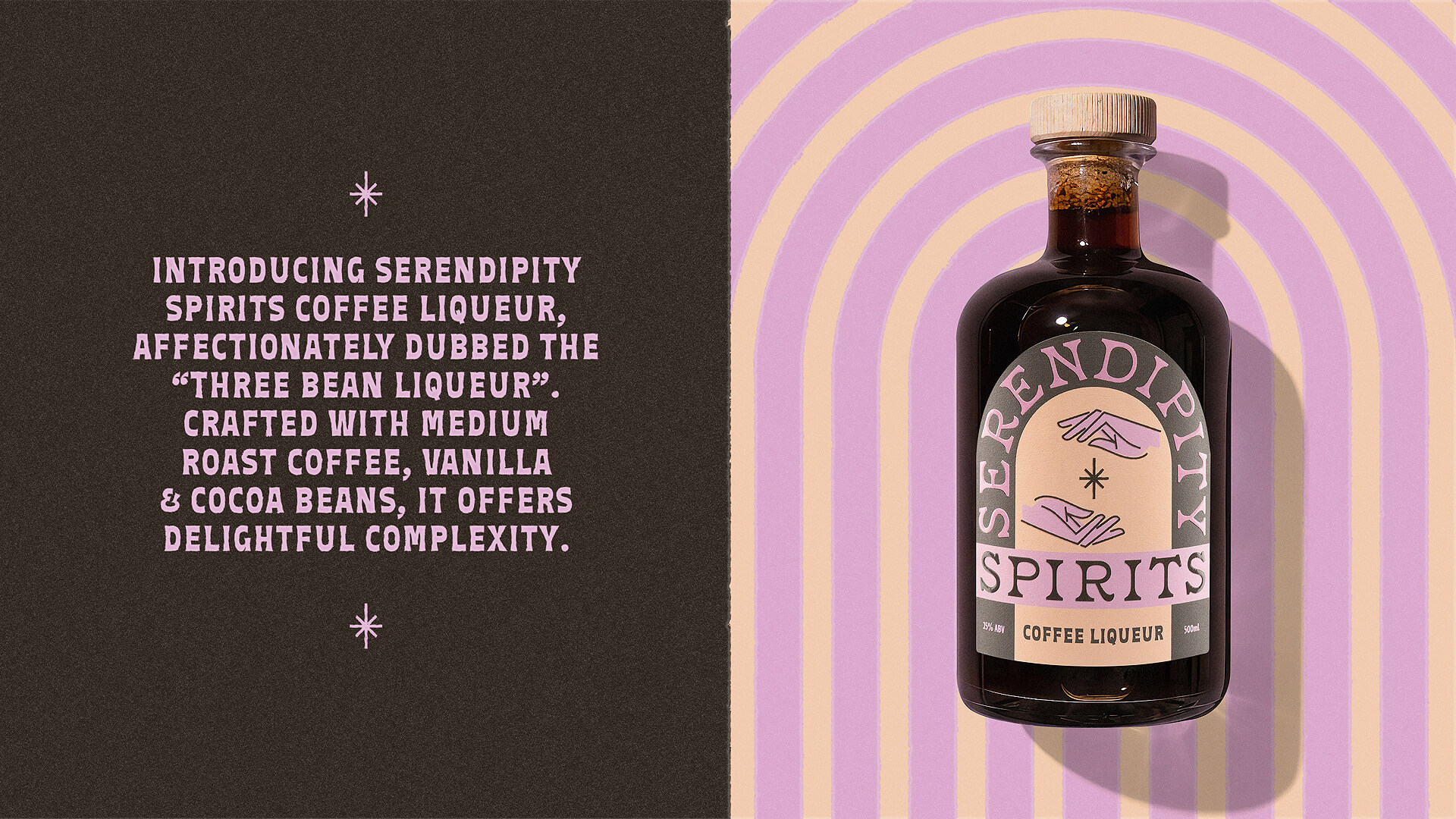
Serendipity Spirits is a boutique Australian beverage brand built around the idea of unexpected delight. The range spans gin, vodka, limoncello and coffee liqueur, each one made for those unplanned moments that tend to become the most memorable. The brand was shaped through a focused approach to spirits branding and packaging design, creating something that feels distinctive but easy and approachable. It’s a range made for sharing, whether that’s a quiet drink at home or something brought out for an occasion.
The goal was simple. Create something that catches your eye on shelf, but feels easy and approachable. The identity is deliberately minimal. Two hands and a star hint at connection and chance, a quiet nod to the magic moments the brand is made for. Paired with warm, cheerful typography, it gives the brand a clear presence without overcooking it.
Colour does a lot of the heavy lifting across the range. The typography stays consistent, while each variant shifts through colour depending on the liquid inside. It keeps everything connected without becoming repetitive. This approach to label design allows each product to feel distinct while still sitting comfortably as part of the same family. The label sits back and lets the liquid do the talking.
By keeping everything clean and uncluttered, the bottle, the spirit and the brand mark are each given space to stand on their own. The result is a spirits branding and design system that’s easy to recognise and built to grow with the range.
Bottle photography: Astro Creative Co.